http://www.tepco.co.jp/index-j.html
Yes, they have a lot of the same information as the English press releases, but the Japanese releases also include information about the radiation monitors. These are called Monitoring Posts (MP, jp:モニタリングポスト) . One format they release this data in is a somewhat frustrating pdf file. I have hacked at this and am please to present some amount of visualization and interpretation for you here. But first, what's already on the internet?
You can find some very techie work done by Japanese bloggers (or something like that), which is very good, but I could not get all that much out of. Adamu gives a good size up of the present state of radiation safety. One image shows a simple spike from 9-12am on 3-15 from the same source I'm using. The next image shows a spike from a GM (Geiger) counter streaming on the internet. If I understood correctly, this is showing real time data from Hino in Tokyo and a peak that may correlate with a major release from the plant. There is even a stream of a webcam watching the screen of a detector online that has also been getting covered by popular Japan blogging. The media has been shooting stories everywhere about the fact that radiation had been detected in Tokyo, and of course, all the panic that comes with it. I would suggest a skeptical eye in reading most information related to this, but hey, we are living in the digital age, and we should all be empowered to draw actual readings from open sources and compare to the events that are being reported on and judge for ourselves.
So here's is my size up of the released numbers from TEPCO. I still have a lot of polishing to do, but since I haven't seen this detail anywhere else I'm rushing to get it out there.
Start time: March 11, 5:30pm
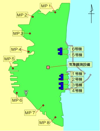
What is this showing? Let's start with the locations. The reports give the following locations:
体育館 - gym
管理棟 - admin building
正門 - plant gate
MP-1,3,4,5,6,7
The first few are self-explanatory, the gate is most important, and the MPs refer to the monitoring posts. Within the report, many locations are denoted with 付近, meaning neighboring area. I mean, some readings were taken at a location, and others were just taken around that location, or at least that's how it appears to me. This is just one of the many things indicating inconsistencies in, or changing of, the method of taking the readings. Maybe we would expect this anyway, given the state the plant has been in. Of course, the monitors themselves will give counts per minute, and it's the job of a health physicist to convert to a dose measurement.
The only reading that comes even close to keeping a good historical record is the plant gate, and this is surely of the most interest. Aside from that, the MPs are strewn around the perimeter of the site. This is simply my speculation, but it would make since no MP would be near a building and release point. I would also speculate that the spikes seen have to do with the intentional venting of steam. The quick uptick and slow decrease could make sense in that case. Otherwise, I will leave the task of correlating this behavior with actual reported plant events for later or for others.
If anyone is interested a little more in the meaning of the radiation readings, consider that the exposure for the average person is 3.6 mSv/year, or 0.41 µSv/h. There are plenty of colorful graphs on the internet for perspective too. For those of us who don't mind Japanese sites, I recommend the example of the Kashiwazaki-Kariwa radiation monitoring webpage. In addition to having their data streaming, they provide fun cartoons showing the effect of snow and rain on radiation readings. I am sure this kind of explanation would be an absolute necessity for presenting the information to the public, since humans absolutely love to make up reasons that a graph is moving one way or the other.
Currently, major media is reporting that a radiation spike has forced workers to suspend operation, which should be very interesting to see once I can get around to looking at the data. I will probably do more with this data soon, including pasting it all over Wikipedia. My main take away is that there was never just a radiation spike. There have been many spikes as well as a constantly increasing level, which looks a lot like a drawn out and continuous battle. Interestingly, I think that makes this accident very different from famous past nuclear accidents.
ADDITION: Another blogger has pointed out the location of the Onagawa monitoring website. I find this very neat, and certainly very useful to the people of Japan right now. But note that this is a different company. Also see monitoring sites for the plants in the area: Fukushima II, Higashi-Doori, and Hamaoka. No guarantee that these sites will work, have up-to-date data, or even make sense. The disaster has far-reaching effects and all the nuclear sites are in various states.
Here is the Fukushima real time data site, and the monitoring post feed, and guess what? It's not working anymore (I mean to say this should be expected). It does, however, give readings from 12/01 through 3/11, and this is useful for the current discussion.
Average: somewhere around 30 to 40 nGy/h, depending on the station
Peak (around 12/3): 100 nGy/h
It gives a zoomed in graph showing readings being normal right up until 3/11, 14:40 (2:40pm), which I believe is, by no coincidence, about the strike time of the quake.
 This work by
No comments:
Post a Comment